Most flyers get a glance of about two seconds before they are folded into a bag or dropped in a bin. That is the whole budget. Everything below is about spending those two seconds well, whether you are promoting a market stall, a class or an opening night.
You do not need design training to design a flyer that works. You need one clear job, a readable hierarchy, and a file that survives the printer.
Design a flyer with one job
The most common mistake is asking a single A5 page to announce an event, explain a business, list five services and collect newsletter signups. Pick the one action you want and let everything else support it.
Build a hierarchy people can skim
- Headline — the one thing, in as few words as it takes.
- Supporting line — the detail that makes the headline believable.
- Visual — one photo or graphic, not a collage.
- Practical details — date, time, place, price.
- One call to action — a short URL or a QR code, never both plus a phone number plus an email.
Type sizes that survive a hallway
A flyer on a wall is read from roughly a metre away, not from arm’s length like a screen. These sizes hold up at that distance on A5 and A4.
| Element | A5 size | A4 size | Notes |
|---|---|---|---|
| Headline | 28–36 pt | 40–56 pt | Should be legible from two metres |
| Subhead | 14–18 pt | 18–24 pt | One line if you can manage it |
| Body | 10–11 pt | 11–12 pt | Never below 9 pt in print |
| Details | 9–10 pt | 10–11 pt | Dates and prices, kept together |
If everything is emphasised, nothing is. Deciding what to make small is the actual design work.
Every art director, eventually
Make it print-ready before you send it
Almost every reprint we see comes down to the same three things: no bleed, text too close to the trim, or an RGB file sent to a CMYK press. Export with these settings and you avoid all three.
Format      PDF/X-4
Colour      CMYK, coated profile from your printer
Bleed       3 mm on every edge
Safe area   5 mm inside the trim — keep all text inside it
Images      300 dpi at final size
Fonts       Embedded or outlined
Our print settings page lists what our partners expect, and the PDF/X specification explains why the format exists if you want the detail.
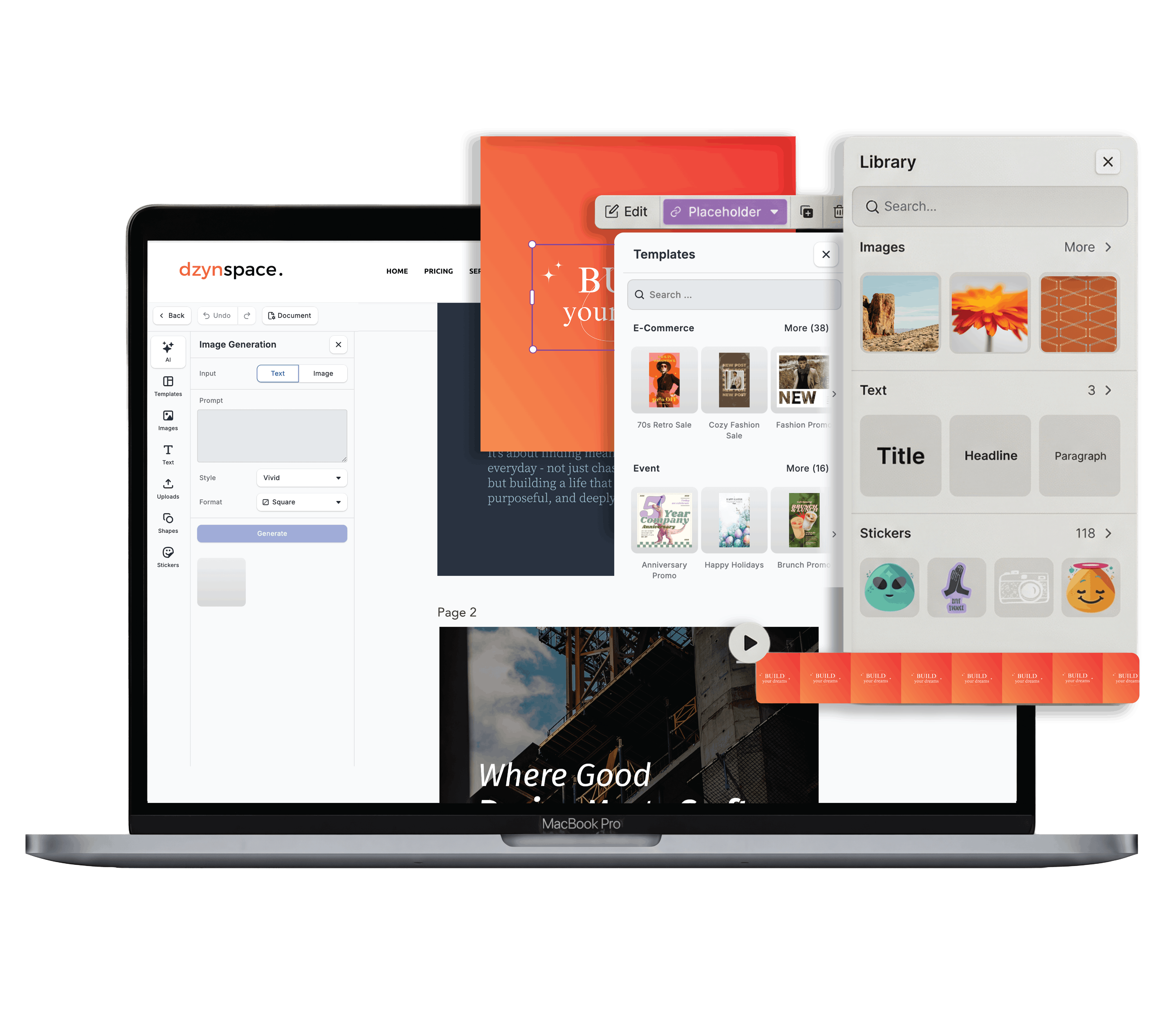
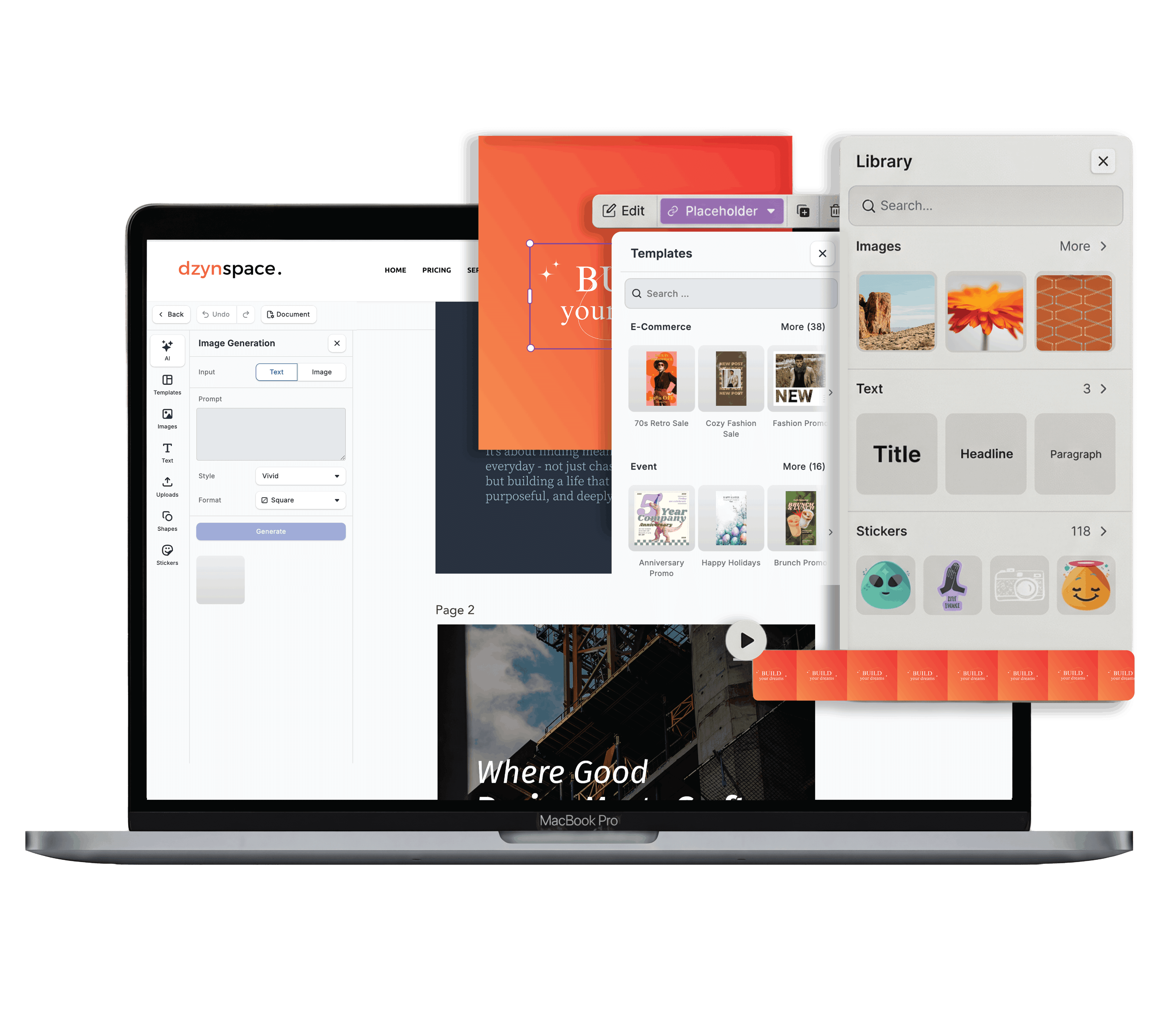
Templates to start from



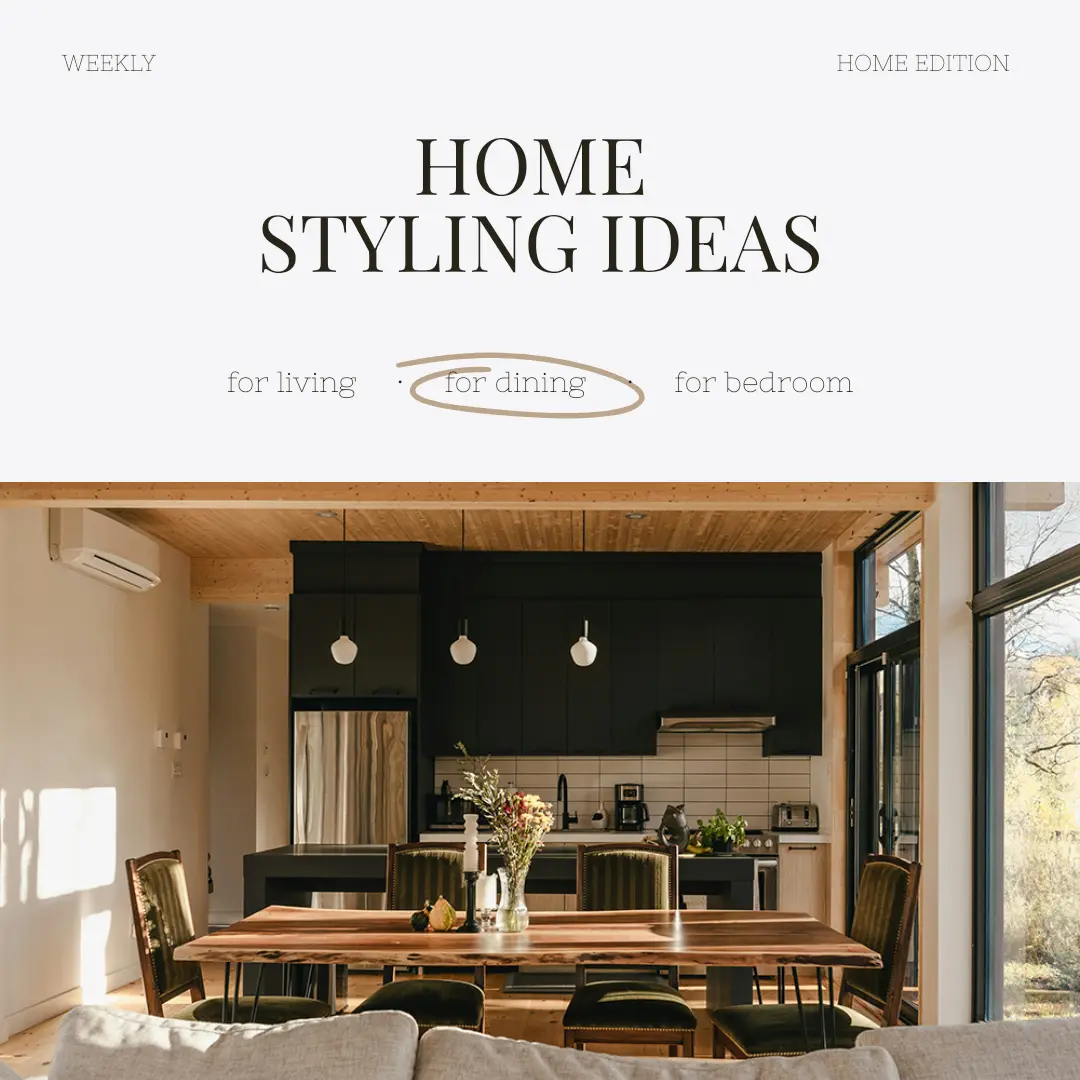
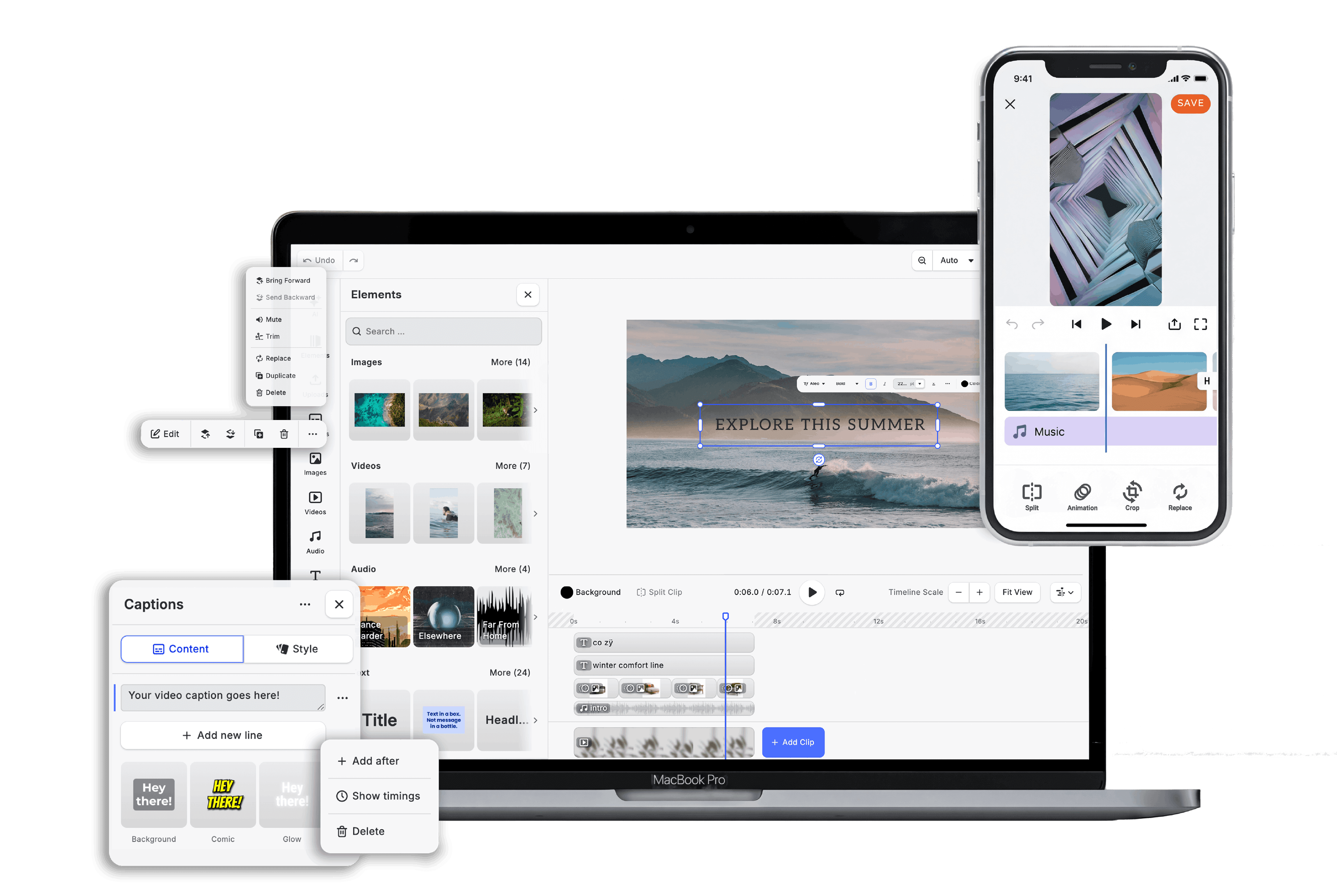
Watch the layout come together
Common questions
What size should a flyer be?
How much text is too much?
Do I need a QR code?
One job, a hierarchy you can skim in two seconds, and a file the printer accepts first time. That is the whole method to design a flyer worth keeping — the rest is taste, and taste improves with reps.